Recent Posts
- Why Consistent Posting Beats Viral Content for Business Growth
- Ad Fatigue Explained: Why Your Campaigns Perform Well Then Suddenly Drop
- Why Visitors Leave Your Website in Under 5 Seconds (And How to Fix It)
- SEO reporting in 2025: What Actually Matters
- Building a Scalable Online Presence in 2025: A Step-by-Step Digital Strategy Guide
Recent Comments
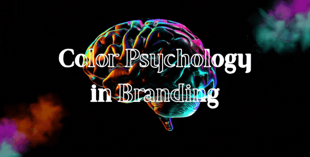
Color psychology in branding plays a powerful role in how people perceive a business, often before they read a single word or understand what the brand offers. Colors influence emotions, build trust, and quietly shape buying decisions. In a world where attention spans are short and competition is high, the right color palette can make the difference between being remembered and being ignored.
Whether it’s the calm confidence of blue, the energy of red, or the reliability of green, brands use color psychology in branding to create emotional connections that drive recognition and conversions.
Why Color Psychology in Branding Matters
Color is not just a design choice; it is a communication tool. Studies show that people form an impression of a brand within seconds, and color is one of the strongest factors influencing that judgment.
When color psychology in branding is used strategically, it helps:
- Establish brand personality and tone
- Build trust and credibility
- Improve brand recall
- Influence customer behavior and decisions
On the other hand, inconsistent or poorly chosen colors can confuse users and weaken brand identity.

How Color Psychology in Branding Influences Emotions
Different colors trigger different emotional responses. Understanding these reactions helps brands choose colors that align with their values and audience expectations.
- Blue conveys trust, professionalism, and stability. It’s commonly used by tech, finance, and corporate brands.
- Red signals energy, urgency, and excitement, making it popular in food, entertainment, and retail.
- Green represents growth, health, and sustainability, often chosen by eco-friendly and wellness brands.
- Yellow expresses optimism and warmth but should be used carefully to avoid visual fatigue.
- Black communicates sophistication, luxury, and authority, especially in premium branding.
By applying color psychology in branding, businesses can guide how customers feel when they interact with their brand.
Choosing the Right Color Palette for Your Business
Selecting the right brand colors starts with understanding your audience and your brand’s core message. Instead of following trends blindly, successful brands focus on relevance and consistency.
Ask yourself:
- Who is my target audience?
- What emotions should my brand evoke?
- How do competitors in my industry use color?
A strong palette usually includes:
- A primary color that defines the brand
- Secondary colors for flexibility
- Neutral tones for balance and readability
When color psychology in branding aligns with brand values, it creates a cohesive and recognizable identity across all platforms.
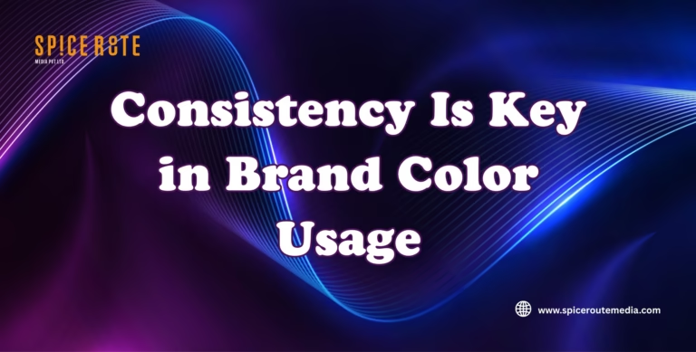
Consistency Is Key in Brand Color Usage
Using the right colors once isn’t enough. Consistency builds trust over time. Your website, logo, social media graphics, advertisements, and packaging should all follow the same color system.
Consistent use of color psychology in branding:
- Reinforces brand recognition
- Creates a professional appearance
- Improves user experience and credibility
Brands that maintain color consistency are more likely to be remembered and trusted by their audience.
Common Mistakes in Color Psychology and Branding
Even strong brands make avoidable color-related mistakes. Some of the most common include:
- Choosing colors based only on personal preference
- Using too many colors without a clear hierarchy
- Ignoring cultural or regional color meanings
- Inconsistent color usage across platforms
Avoiding these mistakes ensures your branding remains clear, intentional, and emotionally effective.
Conclusion
Color psychology in branding is not about aesthetics alone; it’s about strategy, emotion, and perception. The right color palette strengthens brand identity, builds trust, and influences customer decisions long before a purchase is made.
At SpiceRoute Media, we help businesses craft meaningful brand identities through thoughtful design and psychology-driven strategies. From logo creation to complete visual branding systems, we ensure your colors communicate the right message at every touchpoint.
Contact us today to build a brand color palette that connects, converts, and stands out in a crowded digital space.
- No Comments